
尊重用户体验:5种让用户感到被重视的方式
2019-02-06 2101 0
每个人都迫切地需要被接受。他们不一定需要被每个人接受,但他们确实需要被别人接受。这是我们天性的一部分,也是整个天性的一部分。就在我打字的时候,我的猫克利奥卡塔(Cleocatra)正要求我注意她,如果我不注意,她会气呼呼地离开我的房间。(几分钟后:)她没有离开。她用爪子抓我。如果用户在与你的网站互动时,他们的需求没有得到满足,他们也会有类似的反应。人类会将任何东西拟人化,如果他们觉得你的网站不接受他们的本来面目,他们可能会去找一个愿意接受的。或者做爪子的动作。这就是为什么用户在使用你的网站时需要感到被接受和尊重。我已经整理了一些关于如何实现这一点的想法。别指望你的表格里有50个性别,我不是那个要问这个的人;这只是可用性101:1。尊重他们的时间尽可能高效地建立你的网站或产品。当用户因为你的网站在5秒或更短的时间内没有加载而离开时,并不是因为他们有权这样做。因为他们有事情要做,而且每天只有有限的时间去做。如果你的网站要求他们在阅读你的内容、免费电子书或任何你拥有的东西之前跳过一堆障碍,你就是不尊重他们的时间。如果你的注册表格太详细,要求太多的信息,你是在浪费他们的时间。想象一下你参加过的所有可能是电子邮件的会议。如果你的网站感觉更像是去开会,他们不会想去。避免的假设,人们通常讨厌你对他们做出假设。他们讨厌那些假设是错误的,尤其讨厌那些假设是正确的。让人恼火的是,当这些假设伴随着判断而来的时候。该死Netflix。是的,我还在看。一般来说,市场营销多年来一直是基于假设和判断来运作的,它宣扬的是现在被嘲笑的观念,即男性、女性、好父母或好人意味着什么。如果您没有注意到,这些假设多年来一直是争论的主题,现在,许多假设甚至被认为是有害的。当你对谁在或者应该使用你的网站做出过多的假设时,你就有可能流失用户和客户。那么,你为什么要这么做呢?鼓励人们再犯错误,而且会犯很多错误。这很正常,这就是生活,这就是为什么我们有表单验证。现在,如果您的用户正在注册或购买他们认为绝对需要的东西,并且无法到达其他任何地方,那么他们就会留下来。他们会不断地填写你的表格,或者按照你的应用程序神秘的流程来做事情,或者不管发生什么。我知道我个人已经放弃了结账过程,因为最后,我觉得我有点想买的东西不值得我花两次力气去买。我想,如果他们那么想要我的钱,他们就不会让我那么难花了,于是我就寻欢作乐去了。我最讨厌的是要重新填满整个表格。如果有错误,让我回去纠正我犯的一个错误。不要让我重新填写整个表格。这只会让我希望我一开始就没有烦恼。当一个过程失败时,鼓励人们再试一次,不要让他们重做更多的工作。你也可以鼓励他们再试一次,不要让他们因为一开始就把事情搞砸而觉得自己很傻。错误信息应该是清晰、温和和鼓舞人心的。让用户觉得自己很傻是让他们处于守势的最快方法,而守势强的人是不会买东西的。要清楚,错误只是过程的一部分,而且他们更容易被接受。提供明确的指导当人们知道他们“应该”做什么的时候,他们更有可能觉得自己属于这里。学习同伴群体的规则是在新环境中被接受的第一步。清晰的说明可以为用户提供这种信心(并帮助避免他们感到愚蠢的情况)。你可以在你的副本中,在你的微副本中,甚至在那些动画的演练中,现在很多应用都有。我甚至会更进一步,只要有可能,我就会说我已经给出了说明。想想那些看起来像真实信用卡的信用卡输入表单。它们是设置清晰的期望和容易理解的需求的完美例子。对如何在你的网站上做他们想做的事情有清晰想法的用户会觉得他们属于那里。让人与你联系“不,你做得很好。”“别担心。我们这边有。“不,那是我们的错,真的。”“别担心,你做对了。”“好吧,这是一个问题,但我们可以解决它。”“我们都需要不时地得到保证。
 19
19
评论区(0)
正在加载评论...
相关推荐
-
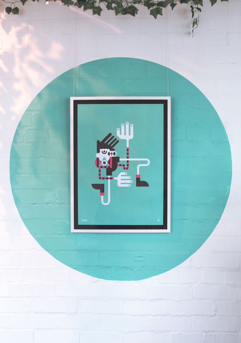 设计欣赏
设计欣赏
设计工作室Agency of None--创意设计
2024-04-02 2862 -
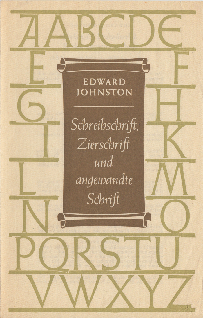 行业资讯
行业资讯
约翰斯顿在皇家艺术学院(Royal Colle
2024-04-02 2672 -
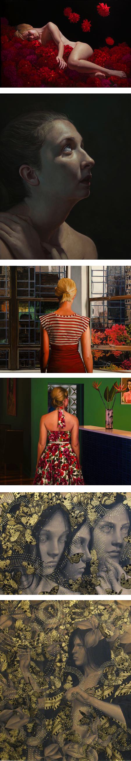 设计欣赏
设计欣赏
纽约阿卡迪亚当代画廊(Arcadia Conte
2024-04-03 2605 -
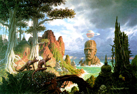 行业资讯
行业资讯
科幻艺术家蒂姆·希尔德布兰特的作品
2024-04-03 2540 -
 行业资讯
行业资讯
艺术家演出海报----设计图
2024-04-03 2526 -
 行业资讯
行业资讯
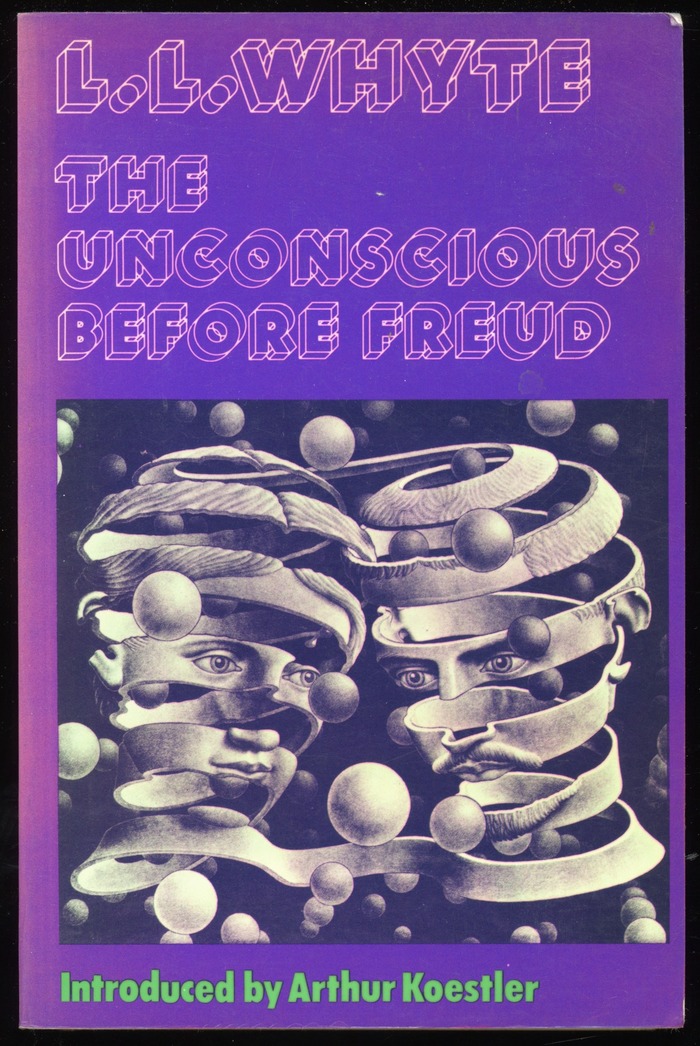
书籍封面---Christof Gassner设计的
2024-04-03 2469 -
 行业资讯
行业资讯
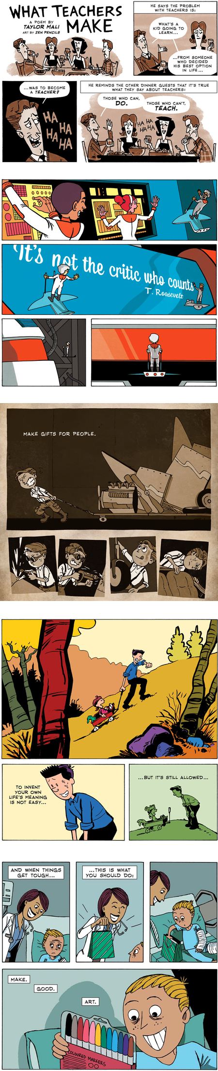
漫画家加文昂丹(Gavin Aung Than)
2024-04-03 2454 -
 设计欣赏
设计欣赏
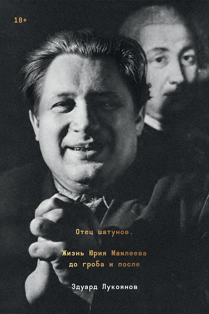
爱德华·卢科扬诺夫写的尤里·马姆列
2024-04-02 2285
