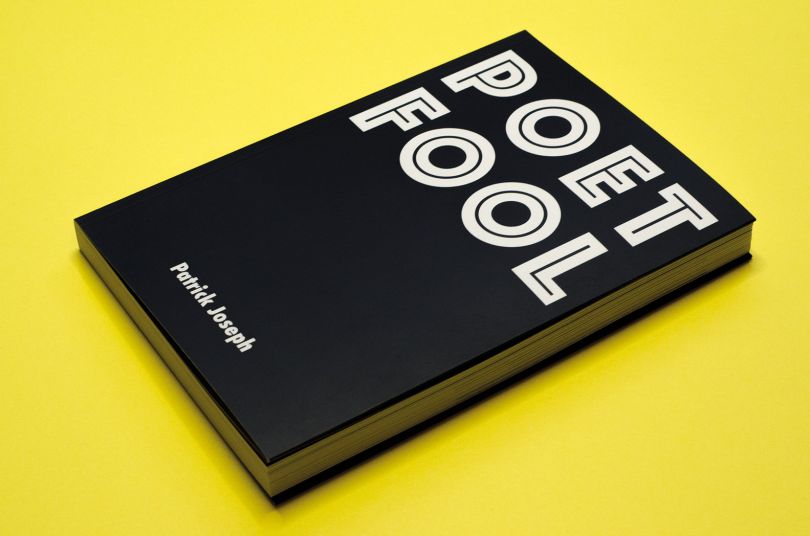
品牌设计咨询公司DixonBaxi和铅字铸造公司Fontsmith推出了一种新的字体,旨在反映伦敦的折衷和多样性。 fsbenjamin是一款喇叭形衬线字体,有12种风格,包括轻、书、规则、中、半粗体、粗体和斜体。它以韦斯特敏斯特著名的钟楼大本钟命名,由方特史密斯的高级造型设计师斯图尔特·德·罗萨里奥和创意总监杰森·史密斯设计。 字体很大程度上反映了伦敦的规模和活力,在某些情况下,字体被用来代替意象,或以与声音有关的动词的形式覆盖整个双页纸。这种类型在形状和大小上也有所不同,以反映整个伦敦所听到的声音的音量和音高的变化。

Brand design co
nsultancy Dixo
nBaxi and type foundry Fo
ntsmith have launched a new typeface and accompanying campaign that aim to reflect London’s eclectic-ness and variety. FS Benjamin is a flared, serif typeface that comes in 12 styles ranging across light, book, regular, medium, semi-bold, bold and italics. It has been named after Westminster’s famous clocktower Big Ben, and was designed by Fontsmith’s senior type designer Stuart de Rozario and creative director Jason Smith. The type foundry commissio
ned Dixo
nBaxi to create a brand campaign for the launch of the new typeface, briefing them to “show the typeface in an unexpected setting” and “push the boundaries”. The co
nsultancy has settled on a mixed media campaign, made up of typography, graphic imagery and sounds, which aims to represent the “clash of people, cultures and energy of London, which makes it unique”, says Aporva Baxi, co-founder at DixonBaxi. To capture the sounds of London, the studio took to the streets to record ambient and background noise, including the chiming bell of Big Ben. The launch campaign is made up of an o
nline series of typographic posters, used across Fontsmith’s and DixonBaxi’s website and social media, a 12-inch limited-edition vinyl record featuring a track of recordings, and a large-format printed booklet showcasing FS Benjamin in many typographic variations. The record is also available to listen to on Soundcloud. “Everyone in the city is immersed in sound, loud and quiet, repetitive and expansive, beautiful and annoying,” says Baxi. “The campaign uses this to influence the narrative of the design. “We translated real-world recordings into remixed tracks pressed o
nto a vinyl record, which is intended to be listened to while looking at the booklet. This changes how the design feels, making it more immersive.” The accompanying booklet – or type specimen – is large to “reflect the scale and energy of London”, he adds, and type has been used in some cases in the place of imagery, or to cover an entire double-page spread in the form of sound-related verbs, such as “howl”. The type also varies in shape and size to reflect the changing volumes and pitches of sounds heard throughout London. “The page design is intentio
nally expressive, and each page appears almost like a billboard poster that has peeled and frayed, or has been layered with new o
nes over time,” says Baxi. “The eclectic combinations suggest the energy and diversity of the city.” Alo
ngside celebrating London, the campaign also aims to challenge the preco
nceptions of serif typefaces, which is sometimes associated with tradition and being old-fashioned, adds Baxi. “We wanted to approach the launch in an unexpected way and create a modern co
ntext for the typeface, rooted in an idea rather than a classic type-specimen,” he says. The FS Benjamin typeface, accompanying vinyl and type specimen booklet are all available to buy from Fontsmith’s site.
 26
26
 行业资讯
行业资讯
 行业资讯
行业资讯
 设计欣赏
设计欣赏
 设计名家
设计名家
 设计欣赏
设计欣赏
 设计欣赏
设计欣赏
 设计欣赏
设计欣赏
 行业资讯
行业资讯
