
昔日美丽的字体
2018-07-30 1739 0
作为设计师,我们似乎已经失去了勇气,推出了同样的品牌,推出了相同的解决方案。也许是网络上缺乏控制。也许这是对国际前景日益增长的需要,以及Helvetica所提供的相应的安全保障。也许设计师们从客户那里得到的尊重越来越少,他们的侄子/表弟/邻居/丈夫认为Arial是她新网站最好的字体。时不时地提醒自己,为什么上世纪30年代如此迷人,为什么上世纪60年代是广告业的全盛时期,以及为什么美国人总是牵动心弦。如果你在寻找灵感,逃避现代设计的贫瘠,或者只是想沐浴在过去轻松凉爽的阳光中,看看乔纳森·劳伦斯(Jonathan Lawrence)的设计吧。这是一种消磨午餐时间的完美方式。以下是我最喜欢的几个例子:你最喜欢这些字母的哪个?你认为现代设计也一样多样化吗?请在评论中告诉我们。
 8
8
评论区(0)
正在加载评论...
相关推荐
-
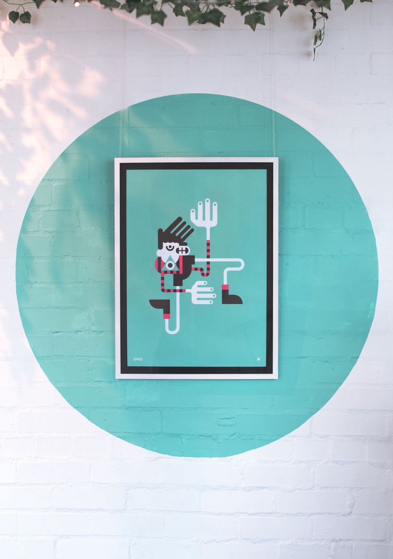 设计欣赏
设计欣赏
设计工作室Agency of None--创意设计
2024-04-02 2813 -
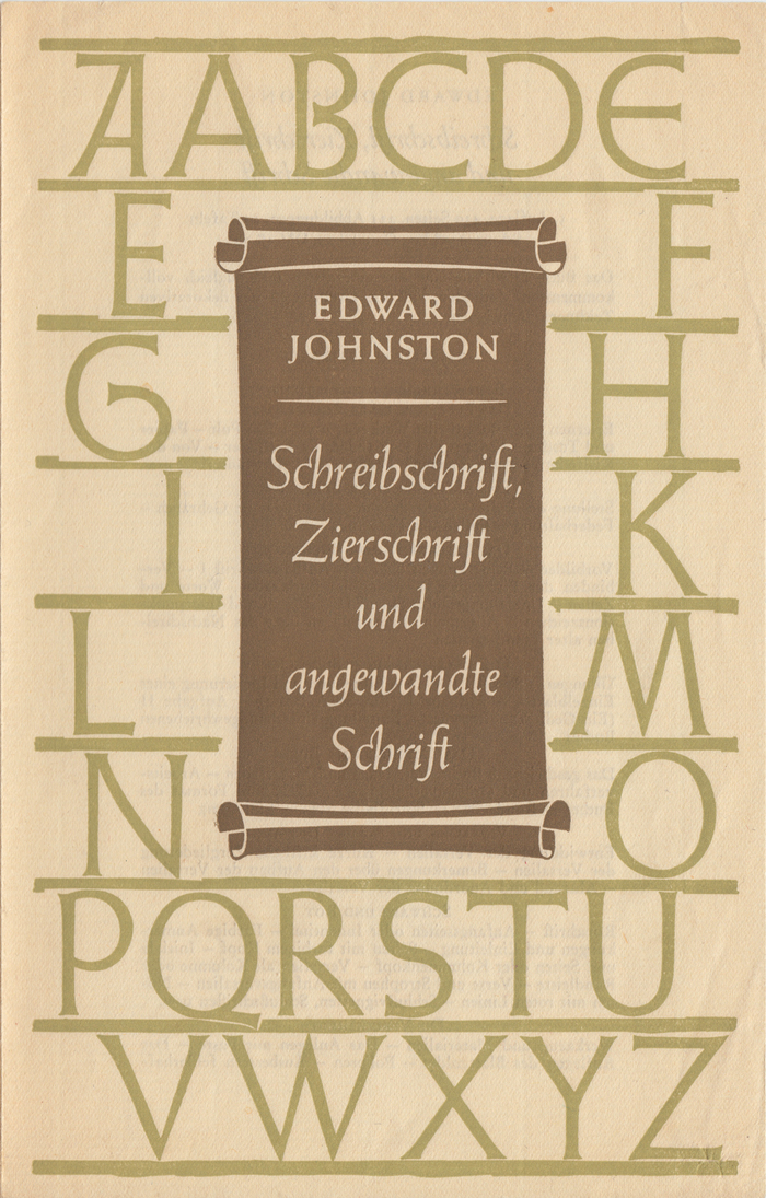 行业资讯
行业资讯
约翰斯顿在皇家艺术学院(Royal Colle
2024-04-02 2659 -
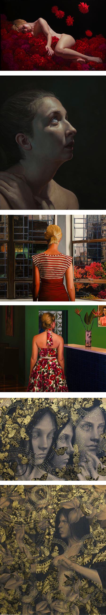 设计欣赏
设计欣赏
纽约阿卡迪亚当代画廊(Arcadia Conte
2024-04-03 2556 -
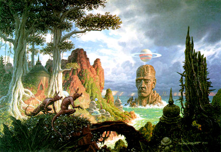 行业资讯
行业资讯
科幻艺术家蒂姆·希尔德布兰特的作品
2024-04-03 2527 -
 行业资讯
行业资讯
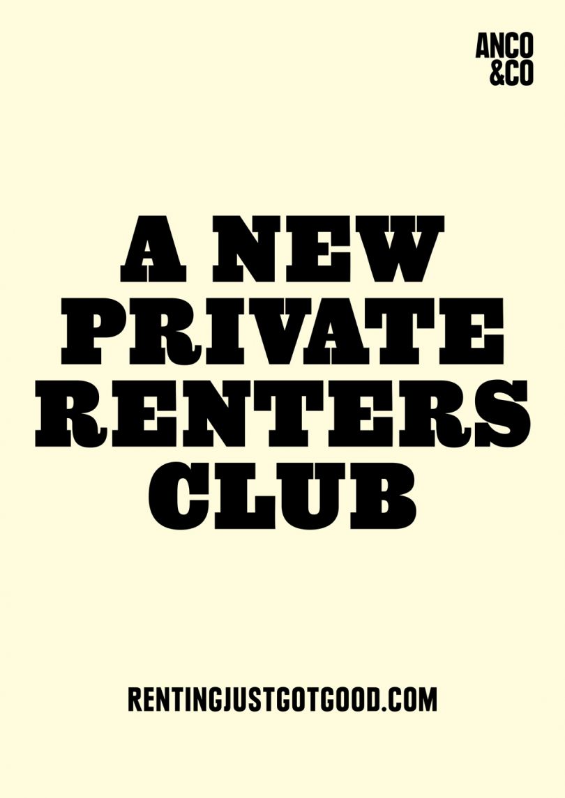
艺术家演出海报----设计图
2024-04-03 2516 -
 行业资讯
行业资讯
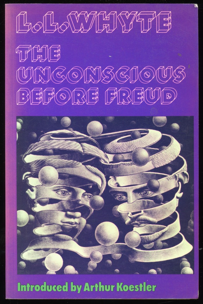
书籍封面---Christof Gassner设计的
2024-04-03 2458 -
 行业资讯
行业资讯
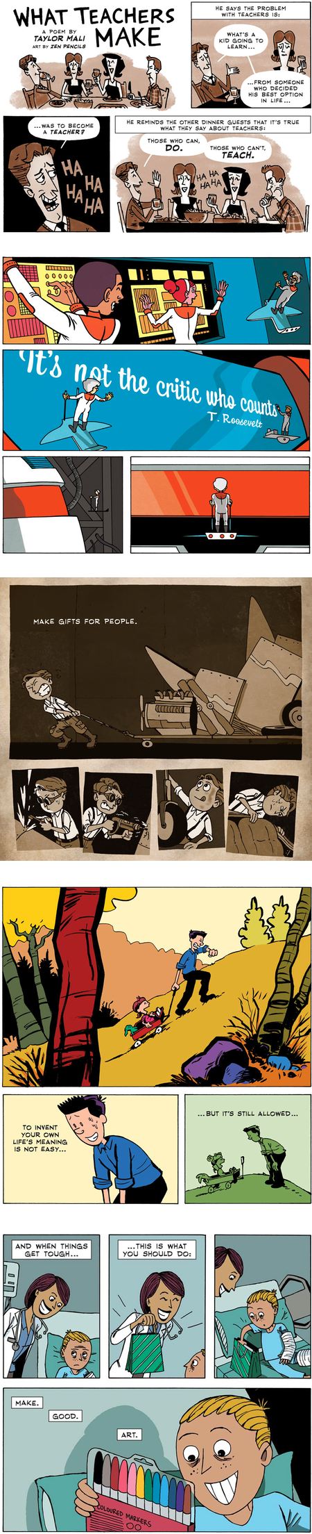
漫画家加文昂丹(Gavin Aung Than)
2024-04-03 2441 -
 设计欣赏
设计欣赏
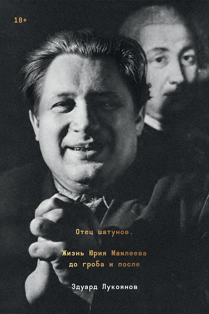
爱德华·卢科扬诺夫写的尤里·马姆列
2024-04-02 2236
