
极简主义标识欣赏
2018-07-23 1918 0
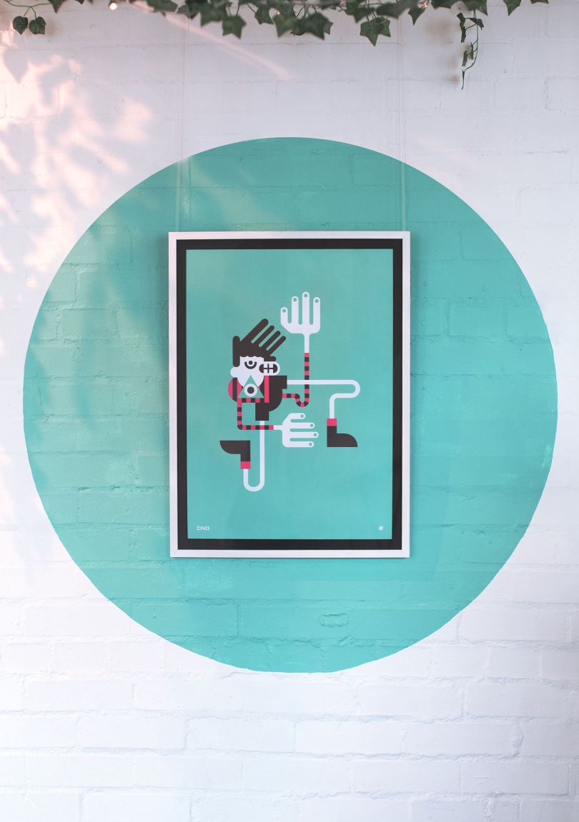
简单而简洁的设计有时甚至比一个logo更有影响力。好的使用形式和消极的空间可以在很大程度上创造一个强烈的视觉印象。最小的标识也可以让你的客户更容易记住。想想百事商标的简洁性,以及它的可识别性。或者是带有隐藏箭头的联邦快递标识。这两款产品都很简单、干净(百事标志的最新版本可能不那么简单),但只要看看它们的形状和外形,就能立刻认出来。看看它们,看看有多少复古的极简主义标识经受住了时间的考验。现代标志这些标志都是在过去十年左右创造出来的。它们结合了清晰的线条和简单的几何形状,并巧妙地运用了色彩(许多是单色的)和负空间。有些是标识符,而另一些则把字母形式保留在标志本身之外。对于一个想要表现出永恒而现代的公司来说,极简主义绝对是一条可行之路。
 23
23
评论区(0)
正在加载评论...
相关推荐
-
 设计欣赏
设计欣赏
设计工作室Agency of None--创意设计
2024-04-02 2796 -
 行业资讯
行业资讯
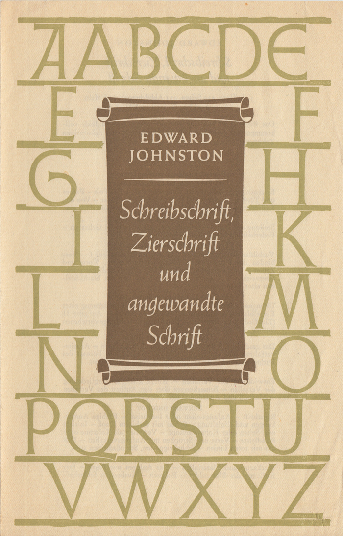
约翰斯顿在皇家艺术学院(Royal Colle
2024-04-02 2652 -
 设计欣赏
设计欣赏
纽约阿卡迪亚当代画廊(Arcadia Conte
2024-04-03 2543 -
 行业资讯
行业资讯
科幻艺术家蒂姆·希尔德布兰特的作品
2024-04-03 2521 -
 行业资讯
行业资讯
艺术家演出海报----设计图
2024-04-03 2513 -
 行业资讯
行业资讯
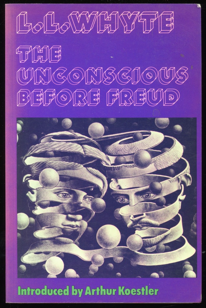
书籍封面---Christof Gassner设计的
2024-04-03 2451 -
 行业资讯
行业资讯
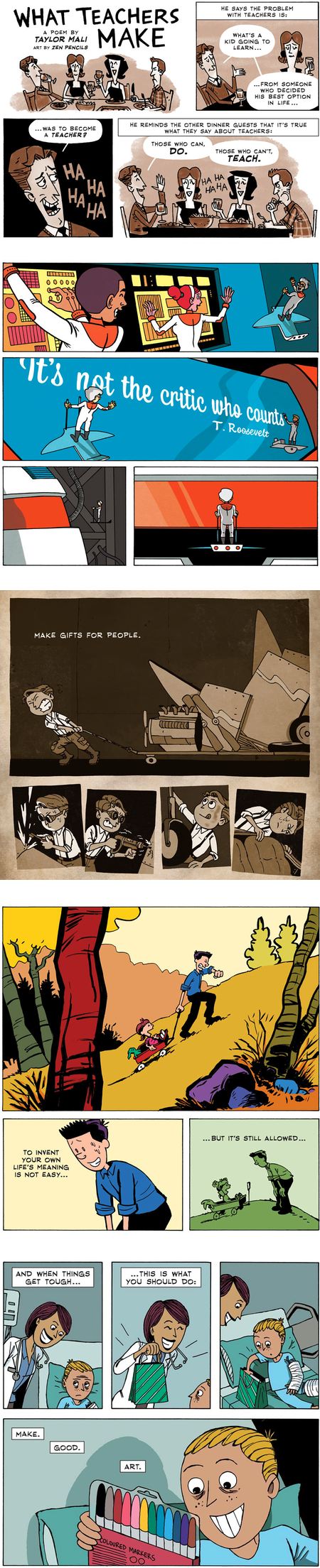
漫画家加文昂丹(Gavin Aung Than)
2024-04-03 2434 -
 行业资讯
行业资讯
澳大利亚建筑师的作品--建筑设计
2024-04-09 2226
