这是来自波兰的设计师Lukasz Ruszel的一个很好的案例。Lucasz向我们解释了logo背后的所有想法,并与我们分享了这个过程的每一步。我的工作是为一个年轻的平面设计师和工程师团队设计一个标志,有一种巧妙的方法,可以为建筑和室内设计项目创造智能和强大的可视化效果。他们想要一个简单、聪明、现代的符号,但同时又要与他们的商业名称联系在一起。在与我的客户交换了几封电子邮件后,我决定通过查找以前创建的几个世纪的符号来开始我的研究过程。事实证明,典型的罗马武士在品牌塑造上是一个很受欢迎的主题:大部分的设计都描述了百夫长的形象,因为这有助于突出头盔上的特征羽流。SketchesVectorizing前两个概念,虽然相当不错(特别是第二个概念),但过于复杂,不够独特。最后一个似乎很接近目标,很容易成为公司的最佳对手。从这一点开始,我集中了我的努力来完善它。最终的结果创造了一个极简主义的,但很容易辨认的描述一个百夫长的头。一个聪明的设计让我的客户兴奋不已。案例研究标志设计

This is a great case study by Lukasz Ruszel a designer from Poland. Lucasz explain all the ideas behind the logo and shares every step of the process with us. Check it out!For more from Lukasz Ruszel visit midgar.eu.GoalMy job was to design a logo for a young team of graphic designers and engineers, with a knack for creating smart and powerful visualizations of architectural and interior design projects.They wanted a symbol that would be simple, clever and modern, but at the same time co
nnected with the name of their business. Research After havin
g exchanged several emails with my client I decided to start my research process by looking up centurion-ba
sed symbols that had been created previously.It turned out that the archetypical Roman warrior is quite a popular theme in branding:Most of these designs depict centurion's profile, as it helps to highlight the very characteristic plume on top of the helmet.SketchesVectorizing The first two concepts, while quite nice (especially the second one), were too complicated and not unique enough. The last one seemed very much on target and easily the best match for the company. From this point on, I have co
ncentrated my efforts on refining it.RefinementsFinal resultI was able to create a very minimalistic, yet easily recognizable depiction of a centurion's head. A smart design that my client was thrilled with. case study logo design
 22
22
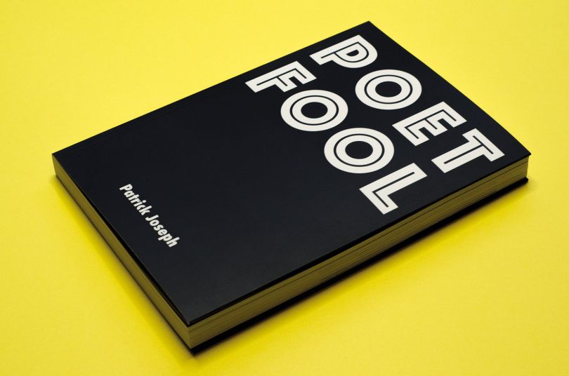
 行业资讯
行业资讯
 设计欣赏
设计欣赏
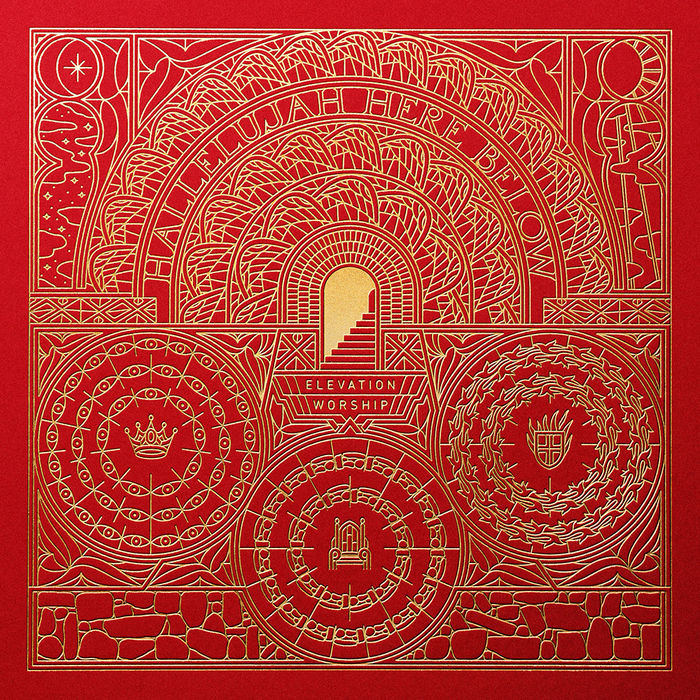
 行业资讯
行业资讯
 设计名家
设计名家
 设计欣赏
设计欣赏
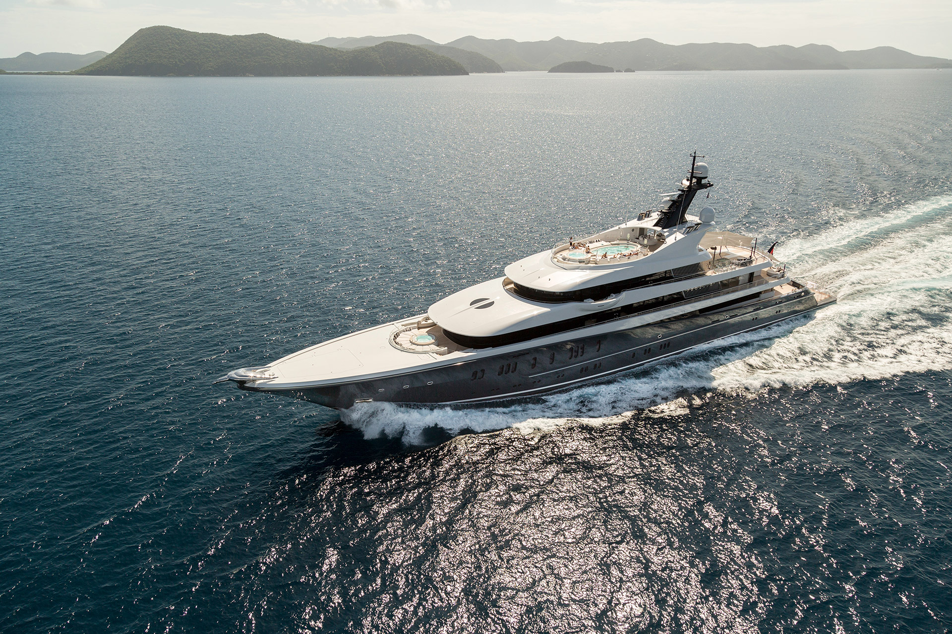 设计欣赏
设计欣赏
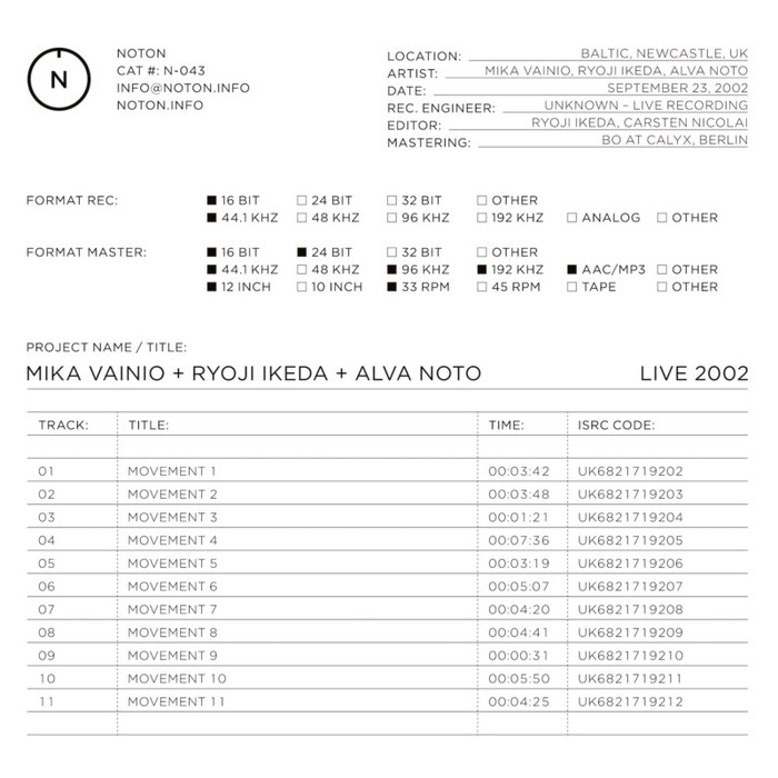 设计欣赏
设计欣赏
 行业资讯
行业资讯
