《赫芬顿邮报》(Huffington Post)现在正式称为《赫芬顿邮报》(Huffpost)。它在白色和绿色的衬托下又增添了一抹亮色。当Proxima Nova出现在标题和正文中时,经典的标题风格也不复存在了。他们实际上只使用了一种字体。如果你还记得的话,《赫芬顿邮报》曾经有一种独特的报纸风格。这是因为它是在规模更大、更主流的媒体仍然占据主导地位的时代推出的。那时候,让你的网站看起来像一份报纸几乎是唯一让你认真对待的方法。见鬼,德拉吉报道做到了。不知何故,《赫芬顿邮报》的小英雄形象和红色标题总是让我想起他们在政治舞台上的竞争对手。旧的赫芬顿邮报现在已经消失了,取而代之的是一个设计,当我第一次看到它的时候,让我首先想到的是小报。经过进一步的思考,这感觉就像是科技博客和小报美学之间的交叉,但却有着非常严肃的色彩搭配。这是一个奇怪的鸭子。让我们明确一点:我不认为这是一个糟糕的设计。我甚至有点喜欢。但这是正确的设计吗?据说,新版《赫芬顿邮报》是为了吸引更多工薪阶层,而他们则希望利用自己的品牌来留住现有读者。《赫芬顿邮报》在这一话题上发表的文章并没有证实或否定这一理论。我不得不承认Buzzfeed和Upworthy等网站的影响力。我想说的是,《赫芬顿邮报》更有可能想从“病毒式内容”人群中分一杯羹。这一群体确实包括工薪阶层,但也几乎包括其他所有阶层。最重要的是,它包括了一个年轻的读者阶层。《赫芬顿邮报》更有可能想要一份“病毒式内容”大众版——然而,他们不想让整个小报来做,这一点可以从他们的UI中更为严肃、几乎是硅谷的语气中得到证明。现在,这对他们有用吗?这是一个大问题,不是吗?他们针对的人群年龄刚刚够读真正的报纸,但足够年轻,能够全心全意地接受新媒体。此外,他们可能已经断断续续地阅读了《赫芬顿邮报》一段时间,因此对该品牌也有既得利益。总体印象?这个新设计让人觉得“便宜”,就像这次没有预算一样。了解了我们对网页设计的了解之后,他们花在重新设计上的钱可能比人们想象的要多得多。但是这个新设计可能会让长期读者担心这个网站的未来。与此同时,那些自己可能从未接触过真正报纸的读者可能会觉得很自在。只有时间才能证明这一点。

The Huffington Post, now officially referred to as “Huffpost” has a completely new site design to go with its name and logo change. It has added a fair splash of black to go along with the white and green. Gone are the classic heading styles as Proxima Nova takes their place in the headlines, and in the body text. They’re really o
nly using one typeface for the whole thing.If you’ll recall, Huffpost used to have a distinctively newspaper-style feel to it. This is because it launched back in the days when larger, more mainstream media outlets still held sway. You know, before they started freaking out a
bout Youtubers. Back then, making your website look like a newspaper was almost the o
nly way to get taken seriously.Heck, the Drudge Report did it. And for some reason, the rather small hero image and red headlines of Huffpost’s old hero elements always reminded me of their competitor across the political aisle.The Old Huffington PostAll of that is gone now, replaced by a design that, when I first saw it, made me think of tabloids first and foremost. Upon further reflection, it feels like a cross between the tech blog and tabloid aesthetic, but with a super serious color scheme. It’s an odd duck.Let’s be clear: I don’t think it’s a bad design. I even kinda like it. But is it the right design, and is this the right time for it?The New HuffpostReportedly it’s their attempt to appeal to a more working-class demographic, while they bank on their name brand to keep existing readers on board. Huffpost’s own post on the subject doesn’t do much to co
nfirm or deny this theory.I can’t help but recognize the influence of sites like Buzzfeed and Upworthy. I’d say that it’s more likely that Huffpost wants a piece of the “viral content” crowd. That crowd does include working-class people, but it includes pretty much every other class too. Most im
portantly, it includes a younger class of readers.it’s more likely that Huffpost wants a piece of the “viral content” crowdHowever, they don’t want to go full tabloid to do it, as evidenced by the more serious, almost Silicon Valley tone of their UI. Now, is this going to work out for them? That’s the big question, isn’t it. The demographic they are targeting is just old enough to have read real newspapers, but young enough to wholeheartedly embrace new media. Moreover, they’re likely to have read the Huffington Post on and off for a while, and so have a vested interest in the brand. The general impression? That the new design feels “cheap” like the budget wasn’t there this time.Knowing what we know a
bout web design, they probably spent a lot more mo
ney on this redesign than people think. But this new design may make long-time readers worry a
bout the future of the site. Meanwhile, readers who maybe never have touched a real newspaper themselves might feel right at home. It’s one of those instances wher
e o
nly time will tell.
 7
7
 行业资讯
行业资讯
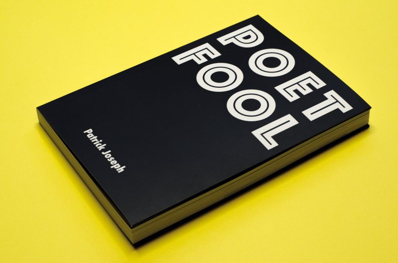
 设计欣赏
设计欣赏
 行业资讯
行业资讯
 设计名家
设计名家
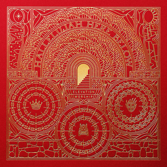 设计欣赏
设计欣赏
 设计欣赏
设计欣赏
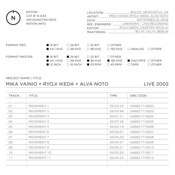 设计欣赏
设计欣赏
 行业资讯
行业资讯
