
潘通将紫外线作为2018年的颜色
2018-06-06 1252 0
Pantone发布了2018年的官方颜色——紫外线(准确地说,是Pantone 18-3838)。潘通自2000年以来就一直在提名今年的颜色,它经常被视为流行文化情绪的晴雨表——尽管设计师们在年度评选中欣然接受潮流调色板,但它往往是一种自我实现的预言。人们通常认为,紫色不是一种紫色,而是一种颜色本身。技术上,紫外线与红外线相似,因为它通常不能被人眼检测到。所以潘通的紫外线被命名更多的是为了营销目的而不是科学的准确性。潘通的《紫外线》是否能代表2018年世界杯还有待观察。2016年玫瑰石英双选宁静号很可能已经被悲伤的黑色所取代;2017年的绿色植物(象征着与大自然重新建立联系)被人们笑着误判了,很可能已经被愤怒的红色所取代。如果我们把潘通的年度色彩作为一种渴望,而不是一种预测,那么它就更有意义了。潘通的色彩研究所为2018年选择了紫外线,部分是为了反映我们生活的这个世界的复杂性:(紫外线)是一种非常引人注目的颜色,但也是一种深思熟虑的颜色……从历史上看,这是一种与独创性、独创性和远见卓识联系在一起的颜色……Pantone Color学会的执行主任也许最能说明潘通的颜色是在2018年,这是一种经常与另一种颜色混淆的颜色,它是以我们无法看到的光谱上的一个点命名的。
 30
30
评论区(0)
正在加载评论...
相关推荐
-
 行业资讯
行业资讯
吴滨 X 米兰设计周:纸随灵动,丈量
2024-04-22 10991 -
 设计欣赏
设计欣赏
首届展览由设计
2024-04-12 2432 -
 行业资讯
行业资讯
澳大利亚建筑师的作品--建筑设计
2024-04-09 2373 -
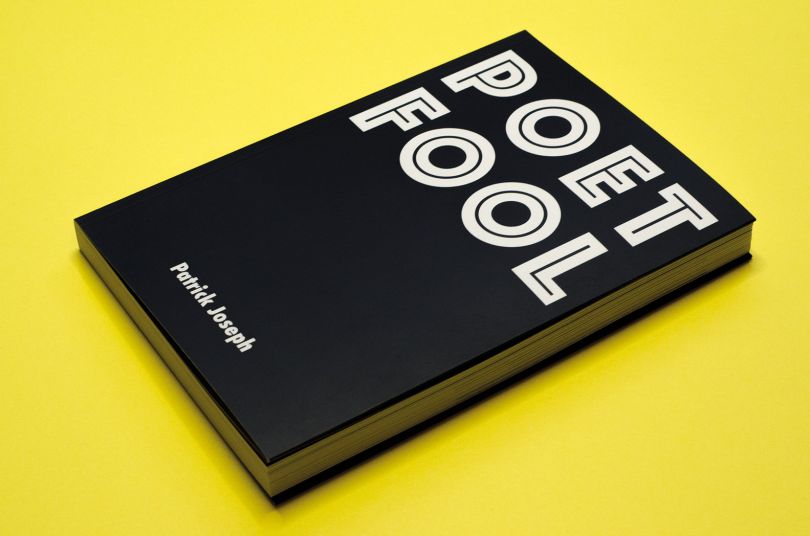 设计名家
设计名家
艺术家帕特里克·约瑟夫(Patrick Jos
2024-04-09 2161 -
 设计欣赏
设计欣赏
泰勒·迪布设计--插图设计
2024-04-08 2144 -
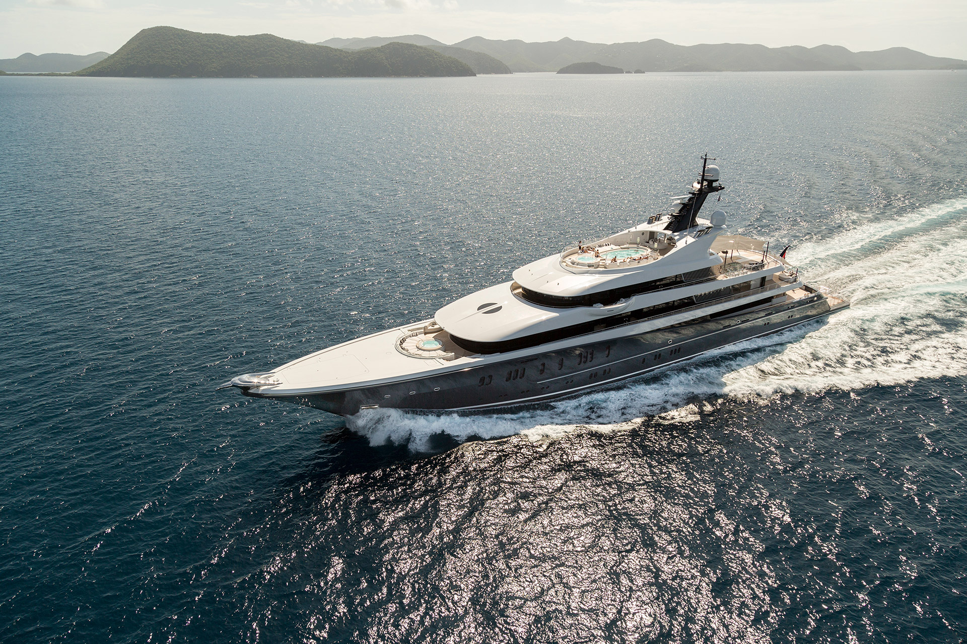 设计欣赏
设计欣赏
游艇内的装修--设计
2024-04-09 2141 -
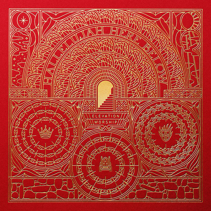
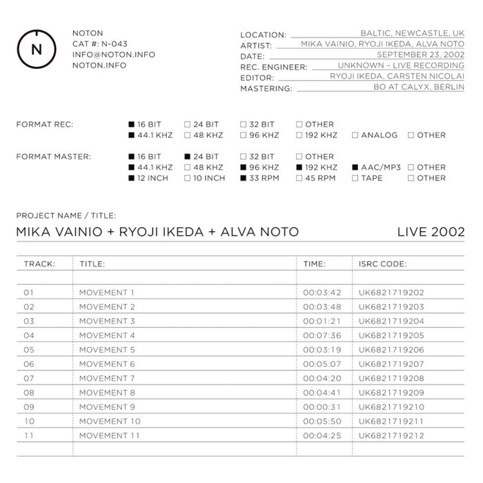 设计欣赏
设计欣赏
音响艺术家卡斯滕·尼科莱(Carsten N
2024-04-09 2107 -
 行业资讯
行业资讯
创意拍摄小技巧
2024-04-17 1952
