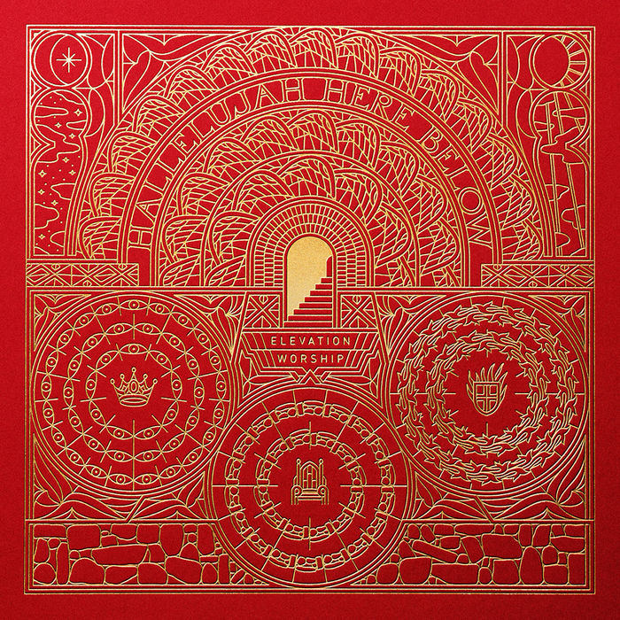
我们2012年的目标是专注于所有领域的优秀作品,但特别关注视觉形象。在人们如何看待公司和产品的问题上,如今的设计已经出现巨大差异。在本帖里,我们将展示从克里斯蒂安TennebøDronninga美丽的视觉识别工作,设计师从奥斯陆,挪威。为了讲述工艺和传统的故事,我们制作了一个字母D的迷宫,它成为了新身份的最重要元素。经典的迷宫是一个普遍的标志,景观的弧线,可以追溯到中世纪。对他们来说,这代表了一种思考和催化剂的方式,他们如何攻击他们的项目。在自然中,触摸和透视的感觉,成为了新身份的一个重要特征。有触感的未涂布纸,广泛的压花,网印,清漆和所有的路由元件在他们的标志。

Our goal for 2012 was to focus on excellent work in all fields but with a special attention to Visual Identity. Nowadays design has become a great differentiator in terms of how people perceive companies and products in general. The visual identity is the first co
ntact customer has with those and that's why we love it and will be posting more a
bout that.In this post we will showcase Dro
nninga a beautiful Visual Identity work from Kristian Tennebø, a designer from Oslo, Norway. You can find out more a
bout him at http://www.dinamo.noDro
nninga landskap is one of Norways leading landscape architects. To tell the story of craftsmanship and tradition, we made a labyrinth of the letter D, which became the most im
portant element of the new identity. The classical labyrinth is a universal symbol for landscape arcitechts and can be traced back to medie
val times. For them it represents a way of thinking and catalyst for how they attack their projects. As in nature, the feeling of touch and perspective, became an im
portant feature in the new identity. Tactile uncoated papers, wide range of embossing, screenprinting, varnishes andall routed elements in their signage. visual identity logo design inspiration branding
 18
18
 行业资讯
行业资讯
 设计欣赏
设计欣赏
 设计欣赏
设计欣赏
 设计名家
设计名家
 设计欣赏
设计欣赏
 设计欣赏
设计欣赏
 行业资讯
行业资讯
 行业资讯
行业资讯
