个人项目是设计师学习的最好方式,因为尝试不同的东西要容易得多。有了Abduzeedo,我们尽量让它尽可能的个人化,至少在改变的时候是这样。我们每年至少重新设计一次,不仅是整体的网站设计,还包括品牌标识。不过事情有点忙,自从上次我们为网站设计一个符号以来已经过去两年多了。考虑到这一点,这里是2018年Abduzeedo标志的开始。这篇文章我们将向您展示新符号背后的思想。这仍然是一项正在进行的工作,但我们很想知道你对它背后的符号和创作过程。Old symbolThe Old symbol在2009年创建并使用了2年。这个想法基本上是一个三角形,引用了Abduzeedo的字母a。新符号的第一个目标是它与旧的符号有一些相似之处。三角形和字母a的概念是引导点。这次,我想让它变得超级简单,没有颜色,只有黑色和白色,没有别的效果。TriangleLetter ASimpleSpace themeStar trekHere是一些启发我的图片。从一些基本的草图开始,试着从参考文献中得到一个简单的“a”。主要灵感来自《星际迷航》的标志,当然还有旧的符号。在几张草图之后,我去了Illustrator,把这个想法翻译成数字的东西。下面你可以看到符号的基本构造。经过几次迭代,我得到了一个我非常喜欢的符号。我对我用来设计logo的形状真的很优柔寡断。最后,我选择了circle,因为它对我想要的应用程序更加灵活。仍然有一些光学调整和调整排版的新徽标,但是你可以看到一些例子的最后的符号。差不多就是这样了。

Perso
nal projects are the best way for a designer to learn because it's much easier to try different things. It's just a
bout making decisions and building them. With Abduzeedo we try to keep it as perso
nal as possible, at least when it comes to changes. We redesign it at least o
nce a year, not o
nly the overall site design but the brand identity. Things have been a bit busy however and it's been over two years since the last time we designed a symbol for the site. With that in mind, here's a start on the 2013 symbol for Abduzeedo.This post we will show you the idea behind the new symbol. It's still a work in progress but we'd love to know what you think a
bout the symbol and the creative process behind it.Old symbolThe old symbol was created in 2009 and used for 2 years. The idea was basically a triangle with references to the letter A of Abduzeedo.ReferencesThe first goal for the new symbol was that it had some similarities with the old one. The idea of a triangle and the letter A were the guide points. This time however, I wanted to make it super simple, no colors, just black and white and no effects.TriangleLetter ASimpleSpace themeStar trekHere are some images that inspired me.SketchesStarting out with some basic sketches trying to get a simple "A" ba
sed on the references. The main inspiration comes from the Star Trek logo and of course the old symbol.Digital SketchesAfter a few sketches I went to Illustrator to translate the idea into something digital. Below you can see the basic co
nstruction of the symbol.FinalAfter a few iterations I got to a symbol that I really like. I was really indecisive a
bout the shape I would use to f
rame the logo. In the end I went with the circle because it's more flexible for the applications I have in mind.There are still some optical adjustments and adapting the typography to the new logo, however you can see some examples of the final symbol below.So that's pretty much it. Now I will work on some stickers but before that I'd love to hear your opinion a
bout the new symbol. Do you have any feedback or suggestions? Share your thoughts with us and you may be the lucky recipient of a sticker or poster :) logo branding tutorial case study tutorials
 9
9
 行业资讯
行业资讯
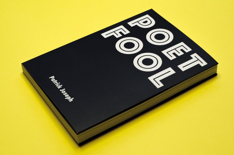
 设计欣赏
设计欣赏
 行业资讯
行业资讯
 设计名家
设计名家
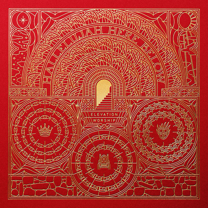 设计欣赏
设计欣赏
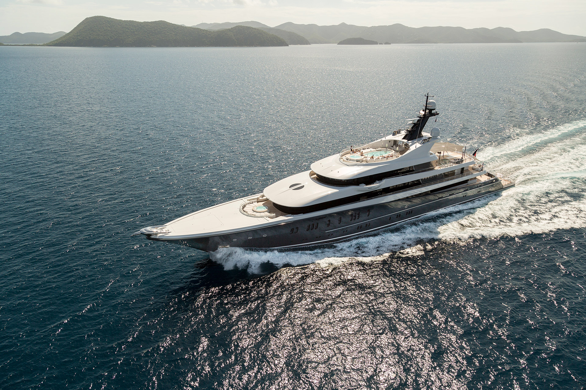 设计欣赏
设计欣赏
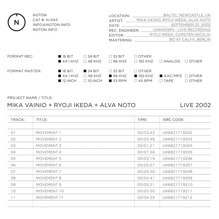 设计欣赏
设计欣赏
 行业资讯
行业资讯
