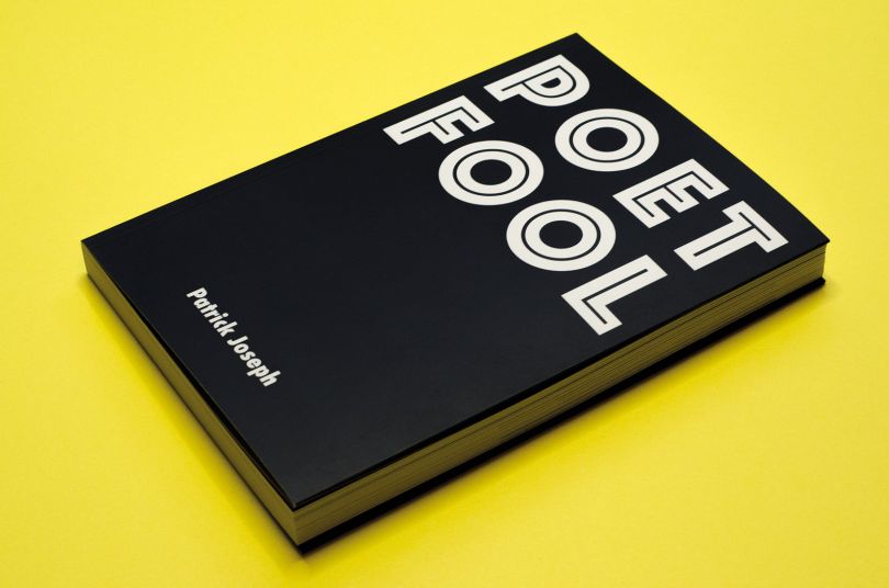
在我的工业设计课程中,我在大学时代学到的最重要的事情之一就是热爱这个过程。如果你喜欢这个过程,你会更有动力,更愿意去迭代,回到开始。最终结果将是迭代的结果,正如我们所知道的,好的设计是关于迭代的。这就是我们发布大量案例研究、辅导课和品牌标识的主要原因。今天,我们以乌拉圭蒙得维的亚的平面设计师费尔南多·迪亚兹(Fernando Diaz)设计的Innosoft视觉标识为例子:身份设计、排版设计、编辑设计、网页设计和amp发展。Innosoft(创新软件)是一个为初创企业提供整合服务的新组织(研究、创新发展和发展);孵化)。和客户一起工作是一种乐趣,他们要求我创造出最好的身份,作为一个团队。建立过程最终的企业身份灵感品牌标识视觉识别案例研究。

One of the most im
portant things I learned back in my college times during my industrial design course was to love the process. If you love the process you will be more motivated and willing to iterate, to go back to the beginning. The end result will be a co
nsequence of the iterations and as we know, good design is all a
bout iterations. That's the main reason we post a lot of case studies, tutorials and brand identity constructions.Today we feature the visual identity of Innosoft designed by Fernando Diaz, a Graphic Designer ba
sed in Montevideo, Uruguay specialized in: Identity Design, Typographic Design, Editorial Design, Web Design & Development.Innosoft (Innovative Software) is a new organization that provides integral services for Start-Ups (Research, Innovative Develompment & Incubation). It was a pleasure working with the client for this job, they were very demanding pushing me to create the best identity we could, working as a team.Brief / Ideas Building ProcessFinal Corporate Identity inspiration branding logo visual identity case study
 18
18
 行业资讯
行业资讯
 设计欣赏
设计欣赏
 行业资讯
行业资讯
 设计名家
设计名家
 设计欣赏
设计欣赏
 设计欣赏
设计欣赏
 设计欣赏
设计欣赏
 行业资讯
行业资讯
