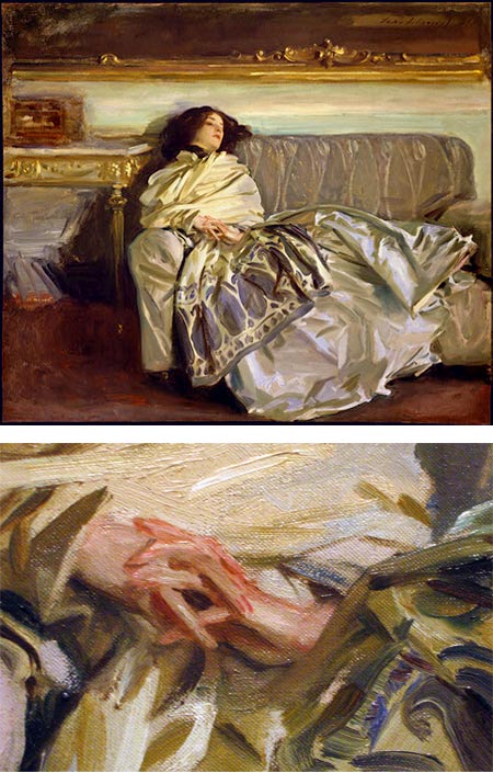
NBC的logo是我最喜欢的标志之一,我相信它可能是由于颜色和简单的孔雀使用了负空间。背后的品牌设计公司是Chermayeff &美国,Haviv和它们是世界上许多最知名的商标之一。自1958年以来,该公司在各个学科领域开创了由创意驱动的平面设计的现代运动,专注于品牌标识、展览、印刷和运动图形,以及建筑艺术。在这篇文章中,我们想分享一些令人惊叹的图片,展示了创建NBC品牌的过程。这是美国全国广播公司(NBC) 1956年第一次在屏幕上展示它的时候,它的质量很好。它既高贵又独特,轻松而可爱。但是,尽管孔雀在全国广播公司(NBC)的彩色电视上是一个令人难忘的象征,但它绝不是公司的官方标志。1985年,孔雀被重新吸引,变得更加简单和现代。这首字母缩写为NBC,以一种特别创造的字体风格加入了它。孔雀自此成为世界上最知名的商标之一。品牌视觉识别灵感

The NBC logo is one of my favorites logos, I believe it might be because of the colors and the simple peacock using the negative space. The brand design firm behind that is Chermayeff & Geismar & Haviv and they are behind many of the world’s most recognizable trademarks. Since 1958, the firm has pio
neered the modern movement of idea-driven graphic design across every discipline, specializing in brand identities, exhibitions, print and motion graphics, and art in architecture.In this post we want to share some of amazing images showing the process of creating the NBC brand. For more information visit http://www.behance.net/CGHFrom the moment the NBC peacock first strutted o
nscreen in 1956, it had star quality. It was both dignified and distinctive, light-hearted and likable. But while the peacock was a memorable symbol for color television on NBC, it was never the company's official logo. In 1985 the peacock was redrawn to be more simple and modern. With the initials NBC added to it in a specially created lettering style. The peacock has since become one of the world's most highly recognized trademarks. branding inspiration visual identity
 15
15
 行业资讯
行业资讯
 行业资讯
行业资讯
 行业资讯
行业资讯
 行业资讯
行业资讯
 设计欣赏
设计欣赏
 设计欣赏
设计欣赏
 设计名家
设计名家
 行业资讯
行业资讯
