我很久没有发布关于视觉身份的信息了,但这即将改变,因为这篇文章是关于一个美丽的视觉形象,是由为大学创造的创意艺术创造的。设计的简单性非常的美丽和永恒。很难不被“创造力”和“创造”的激情所激发。“我们的出发点是一种与设计师和建筑师同义的视觉语言,并将其作为一种标记工作进展的方式,即不起眼的模板。”正是来自这种子,身份才得以成长。我们已经在标志中创建了一个坚固的锚点,其重要的模板部件将形成标识符增长的视觉根。它的创造潜力没有止境,可以逐年发展。英国/视觉识别品牌

I haven't posted a
bout visual identities in quite a while but that is a
bout to change because this post is a
bout a beautiful visual identity created by Spin for the University for the Creative Arts. The simplicity of the design is strikingly beautiful and timeless.It was difficult not to be inspired by the passion for ‘creativity’ and ‘making.’ Our starting point is a visual language syno
nymous with designers and architects and employed by them as a way of marking work in progress, the humble stencil. It was from this seed the identity grew. We have created a solid anchor point in the logo whose essential stencil compo
nent parts will form the visual root from which the identity grows. Its creative potential has no end and can be developed year on year.Scope of work:Identity co
ncept and creatio
nStationery and templatesWebsite co
nsultationArt directio
nPrinted matterMotion graphicsFilming and editingSignageEnviro
nmental graphicsFor more information check out http://spin.co.uk/ visual identity branding
 29
29
 行业资讯
行业资讯
 设计欣赏
设计欣赏
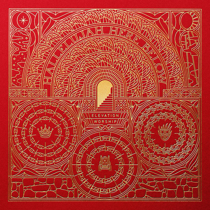 设计欣赏
设计欣赏
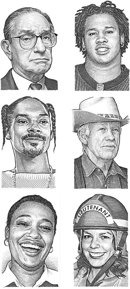
 设计名家
设计名家
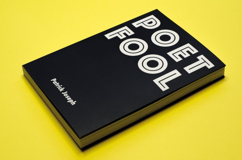
 设计欣赏
设计欣赏
 设计欣赏
设计欣赏
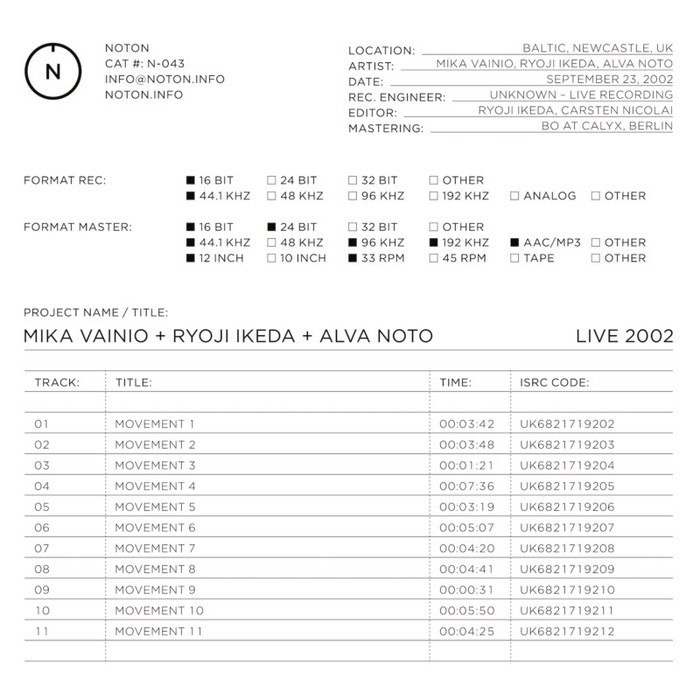
 行业资讯
行业资讯
 行业资讯
行业资讯
