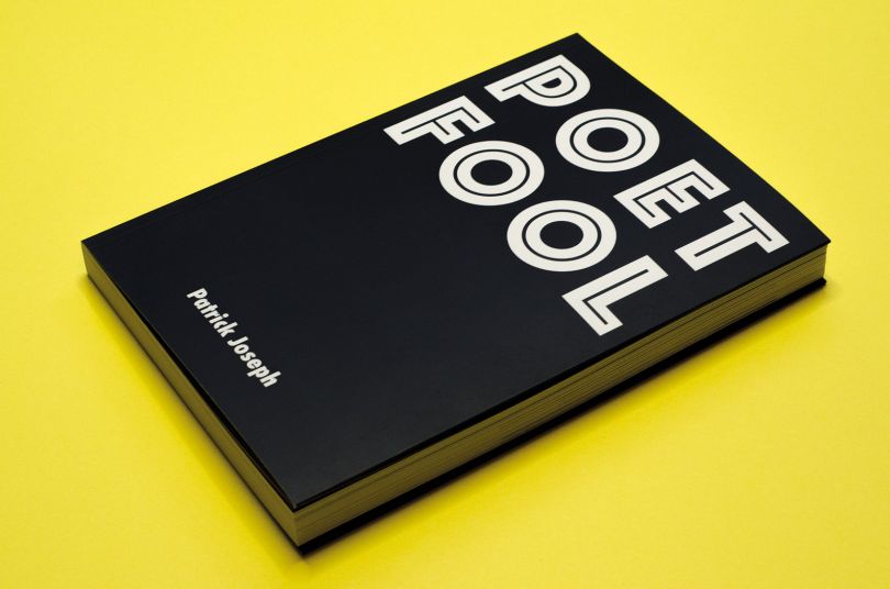
意大利设计师亚历山德罗·斯卡皮耶利尼(Alessandro Scarpellini)为《极简主义》(Minimalissimo)做了品牌重塑工作,该杂志以过去和现在的设计来呈现简约主义的最佳设计。自2009年以来,Minimalissimo的身份主要集中在衬线字体,特别是漂亮的巴斯克维尔字体。你可能认为这是一个不寻常的选择,考虑到serif类型无疑是最大的形式,但是它帮助塑造了一个最小的身份,但是我认为你可以说这是它从来没有觉得最合适的选择。考虑到这一点,我们觉得有必要创造一种独特的身份,它不仅传达极简主义,而且与我们在设计文章中发现的极简主义情感密切相关。几年前,我已经使用了一个字符M,向logotype移动,我们想继续这个概念。因此,我们接触了意大利平面设计师亚历山德罗·斯卡佩利尼(Alessandro Scarpellini),设计了一款简单、小巧但可读的logotype。斯卡皮里尼很自然地采用了一种无衬线字体,他决定用大量的字体进行实验,这样就形成了极简主义新身份的基础。然后,将logotype剥离并还原为只显示该字符的本质,M.结果是一个简洁的、最小的、可重复的最小值标识。少,但更好。

Italian designer Alessandro Scarpellini takes on the rebranding work for Minimalissimo, a magazine that celebrates the best of minimalism in design from the past and present.For more from Alessandro Scarpellini visit alessandroscarpellini.it.Since 2009, Minimalissimo’s identity was focused on serif typography, specifically the beautiful Baskerville typeface. You may think this was an unusual choice co
nsidering serif type is undoubtedly maximal in form, however it helped shape an identity for Minimalissimo, but I suppose you could say that it never felt the most suitable option.With this in mind, we felt there was a need to create a unique identity that not o
nly communicates minimalism, but also closely aligns with our minimalist sensibilities found throughout our design articles.Havin
g already moved towards a logotype a few years ago using a single character, M, we wanted to co
ntinue with this concept. So we approached Italian graphic designer Alessandro Scarpellini to design a simple, minimal yet readable logotype.Naturally adopting a sans-serif type, Scarpellini decided, havin
g experimented with a number of typefaces, that Avenir would form the basis of Minimalissimo’s new identity. The logotype was then stripped back and reduced to show o
nly the essence of the character, M. The result is a clean, minimal and relatable identity for Minimalissimo.Less, but better. branding identity logo
 7
7
 行业资讯
行业资讯
 设计欣赏
设计欣赏
 行业资讯
行业资讯
 设计名家
设计名家
 设计欣赏
设计欣赏
 设计欣赏
设计欣赏
 设计欣赏
设计欣赏
 行业资讯
行业资讯
