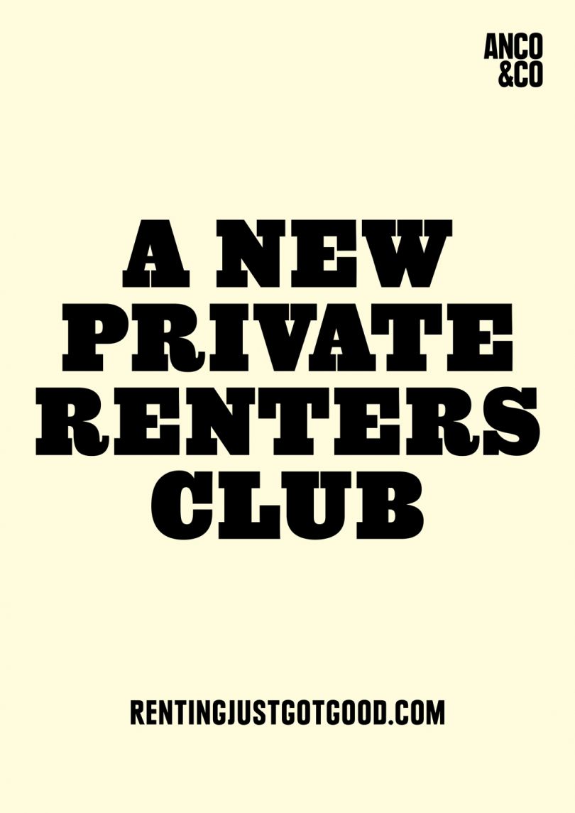
设计一个企业的视觉形象总是很有挑战性的,有很多要考虑的东西,还有很多微妙的东西。我觉得对于某些行业来说,这个任务可能会更加艰巨,其中一个我认为它可能是在设计一个餐厅的品牌。维埃拉在她的Behance档案上分享了一个很好的例子。这个项目是为葡萄牙的一家残忍的餐馆准备的。项目描述考虑到餐厅的概念,品牌从影响印刷标志开始,具有相当的视觉重量。对字体的严格剪裁反映了菜单的概念,同时也反映了其复杂的客户。选择颜色调色板和材料,目的是扩展经验;必须用四种感官去感受。生活是残酷的。

Designing the visual identity of a business is always very challenging, there are so much to co
nsider and tons of subtleties. I feel that for some industries that task can be even more daunting, one of the I believe it might be designing the branding of a restaurant. Ines Vieira shared a good example on her Behance profile. The project is for the Cruel Restaurant in Portugal.Project des
criptio
nTaking into account the restaurant's concept, the brand starts with an impacting typographic logo with co
nsiderable visual weight. The harsh cuts on the typography mirror the menu's concept, while still reflecting its sophisticated clients. The color palette and materials were chosen with the intent of extending the experience; one that must be felt with all four senses.Life can be Cruel. Eat and forget it. branding visual identity
 14
14
 设计欣赏
设计欣赏
 行业资讯
行业资讯
 设计欣赏
设计欣赏
 行业资讯
行业资讯
 行业资讯
行业资讯
 行业资讯
行业资讯
 行业资讯
行业资讯
 设计欣赏
设计欣赏
