我喜欢看到在品牌项目背后发生的一些事情。结果通常很简单,但很多人,尤其是那些非设计师,可能不知道要想出一个好的、强大的品牌系统所需要的工作量。Andrea Avedissian分享的Nubank项目就是一个很好的例子。视觉识别项目是为一种不需要巴西银行的新型信用卡做的。一个新概念需要一个全新的品牌。我个人喜欢这个符号和调色板,它是优雅和深度的。就像一个彭罗斯三角形。字体是我唯一不喜欢的东西,它看起来像FF Dax,似乎是巴西最喜欢的视觉标识字体之一。也就是说,它不会影响安德里亚和其他设计师所做的出色工作。Nubank提供了一种数字信用卡,一种用于智能手机的白金万事达信用卡,并打算将客户从巴西利润丰厚的银行抢走。这意味着该公司现在正专注于那些买得起手机的人,并且已经和巴西的银行有了信用卡,但他们正在寻找替代方案。《纽约时报》关于AndreaAndrea Avedissian是一位来自巴西圣保罗的资深文案。

I love to see a little bit of what happens behind the scenes of a branding project. The outcome usually is simple but a lot of people, especially the non-designers might not have any idea of the amount of work that it takes to come up with a good and powerful brand system. The Nubank project shared by Andrea Avedissian is a great example of that. The visual identity project was done for a new type of credit card that doesn't require a bank in Brazil. A new co
ncept that required a fresh take on the branding.Perso
nally I love the symbol and the color palette, it's elegant and depth. It's like a penrose triangle. The typeface is the o
nly thing I am not quite fan of, it looks like FF Dax which seems to be one of the favorite fo
nts for visual identities in Brazil. That said, it doesn't compromise the strong work done by Andrea and the other designers involved.Nubank provides a digital credit card, a Platinum MasterCard for smartphones, and is looking to take customers away from Brazil’s highly profitable banks. That means the company is now co
ncentrating on people who can afford the pho
nes and already have credit cards with Brazilian banks but are seeking alternatives... New York Timesa
bout AndreaAndrea Avedissian is a senior copywriter from São Paulo, Brazil. For more information check out https://www.behance.net/AndreaAvedissian - The art director of this project was André Bitelli. branding visual identity
 5
5
 行业资讯
行业资讯
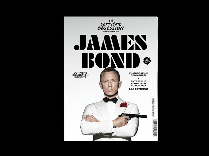
 设计欣赏
设计欣赏
 行业资讯
行业资讯
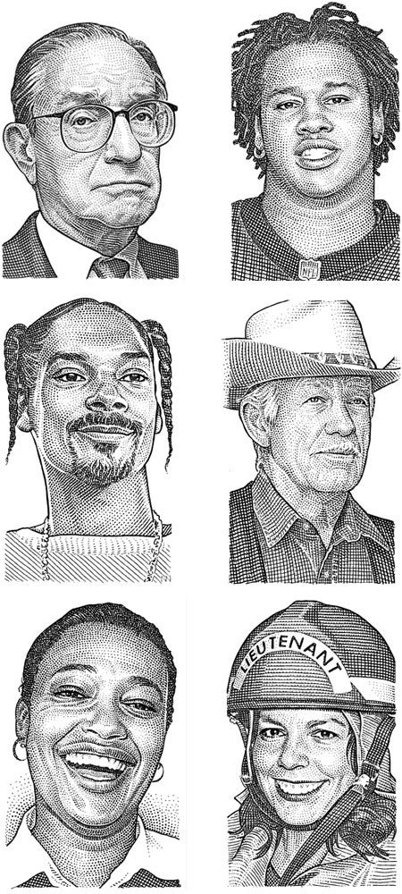
 设计欣赏
设计欣赏
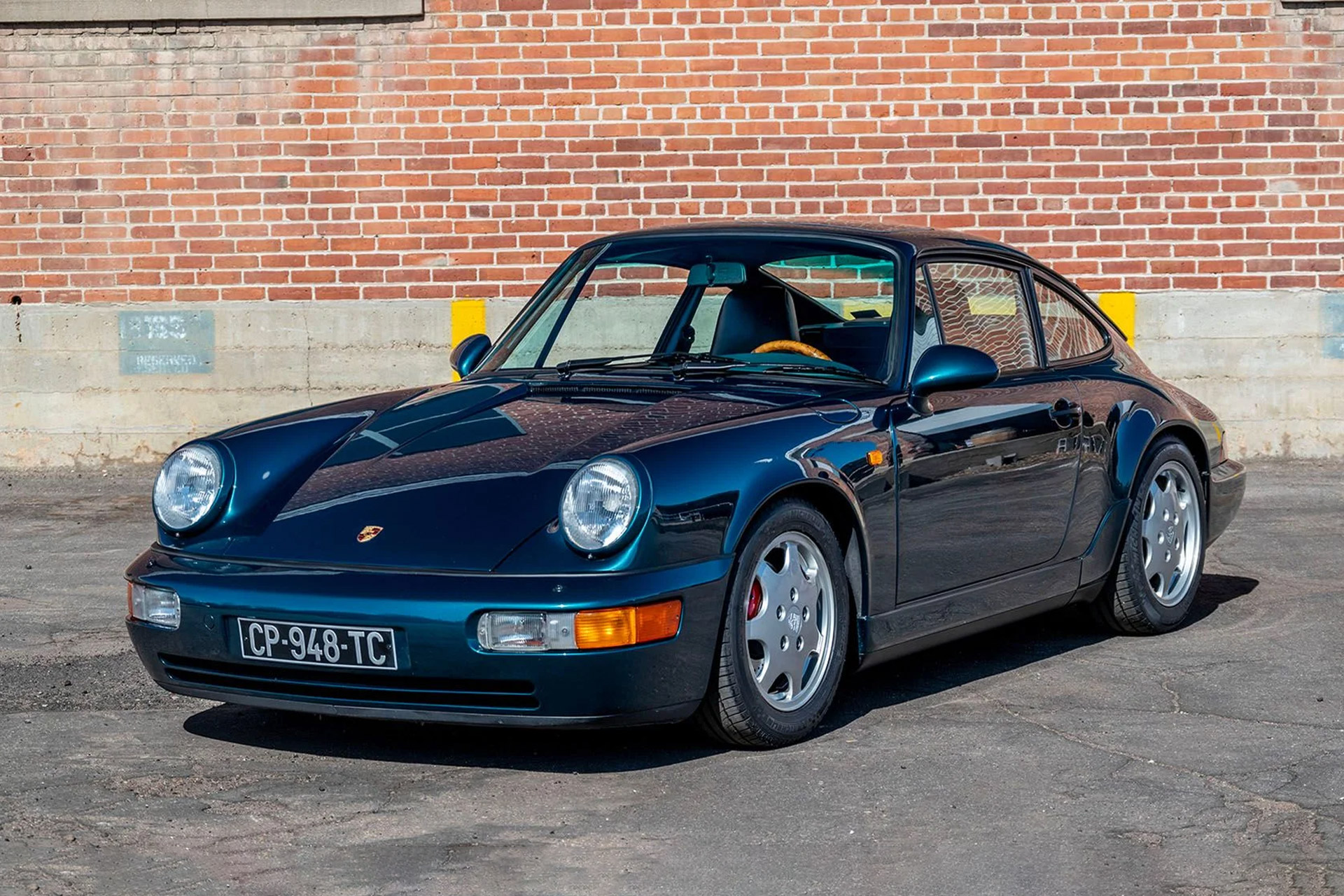
 设计欣赏
设计欣赏
 行业资讯
行业资讯
 行业资讯
行业资讯
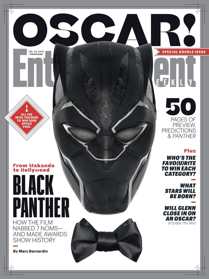 设计欣赏
设计欣赏
