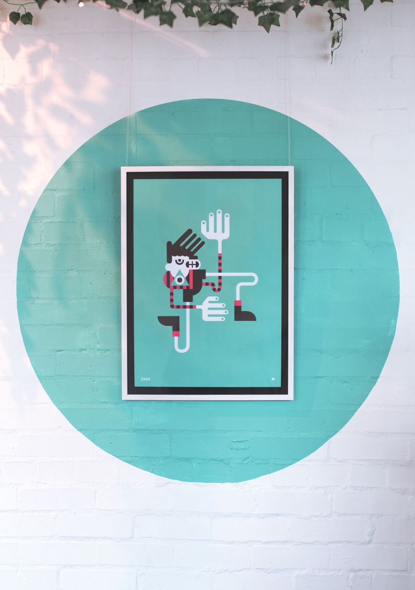
让我们一起分享这个品牌和品牌;7循环的视觉识别项目,一个自行车工作室,它的目标是在短时间的锻炼和有趣的地方做最好的运动;这是一种让人兴奋的气氛。在品牌的背后,设计是由英亩来完成的,有微妙的渐变和难以实现的打印。
我想说的是,印刷在黑暗中可以发光是一种很好的触摸,非常美丽。阿克是位于新加坡心脏地带的一所设计房屋。他们专注于品牌、经验、室内设计和产品设计。两种不同的情绪表现在内部——强度和平静的区域。在健身房和楼梯间,我们用黑色的灯光和霓虹灯照亮了空间,激发了更强烈的氛围和体验。用霓虹灯装饰的Peranakan motifs在楼梯间创造了一种流行艺术的美学,并将其与在窗户上使用的相同图案放在一起,尽管是白色的。相比之下,淋浴间、果汁酒吧和接待室的氛围是轻松的。这个手势的目的是为了在一天的健身活动之后,为社区、谈话和放松营造一种平静的氛围。

Let us share this branding & visual identity project for 7Cycle, a cycling studio that aims to make the best of a short workout of exercises and wher
e it gets interesting; a rave-like atmosphere to switch it up. Behind the brand, the design has been done by ACRE, with the subtle gradient happening and hard to achieve on print. I would say the fact that the print can glow in the dark is quite a nice touch and very beautiful. ACRE is a design house located in the heartlands of Singapore. They are focusing their work on branding, experience, interior design and product design. Two different moods were expressed in the interiors – areas of intensity and calm. For the workout studio and stairwell, we lit the space with black light and neon elements to invoke a more intense atmosphere and experience. Peranakan motifs in neon was employed to create a pop-art aesthetic on the stairwell, juxtaposed with the same motifs employed on the windows albeit in white. In contrast, the ambience in the showers, juice bar and reception space is light. The intention of the gesture was to promote a calm atmosphere for community, co
nversation and relaxation after a rewarding day’s work in the gym. branding visual identity graphic design