博斯普鲁斯海峡的名字源于博斯普鲁斯海峡,这是流经伊斯坦布尔的一段水域。翻译这句话的意思是一头公牛在涉水。从这个简单的,但迷人的牛的性格被创造来拟人化的品牌。一个简约的调色板只有两种颜色,绿松石和木炭,给予品牌强烈的认可。一系列的图标和一个三维版本的牛被创造出来给这个品牌一个与众不同的网上存在。草图设计最终灵感品牌视觉识别。

 28
28
 行业资讯
行业资讯
吴滨 X 米兰设计周:纸随灵动,丈量
2024-04-22 11001 设计欣赏
设计欣赏
首届展览由设计
2024-04-12 2462 行业资讯
行业资讯
澳大利亚建筑师的作品--建筑设计
2024-04-09 2380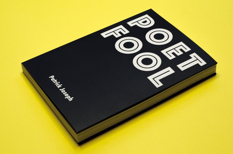 设计名家
设计名家
艺术家帕特里克·约瑟夫(Patrick Jos
2024-04-09 2181 设计欣赏
设计欣赏
泰勒·迪布设计--插图设计
2024-04-08 2174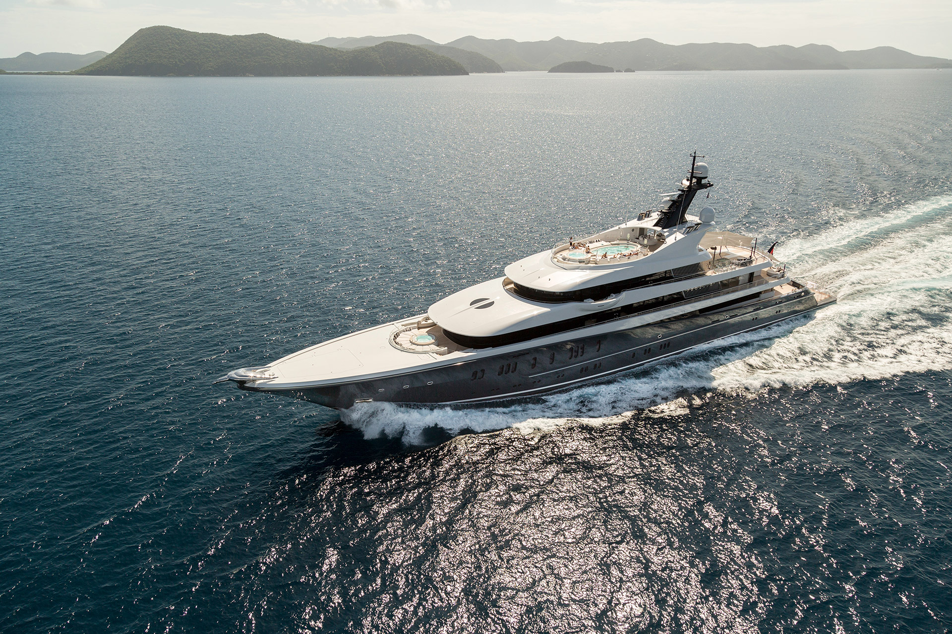 设计欣赏
设计欣赏
游艇内的装修--设计
2024-04-09 2168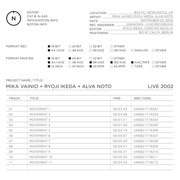 设计欣赏
设计欣赏
音响艺术家卡斯滕·尼科莱(Carsten N
2024-04-09 2135 行业资讯
行业资讯
创意拍摄小技巧
2024-04-17 1959